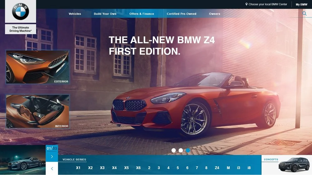
PRODUCT ACCESSIBILITY ENHANCEMENT
The challenge was to enable consumers to have access to BMW’s entire product line and featured series directly from the homepage above the fold.
The goal was to retain the distinctive look and feel of the current BMW website while refining its aesthetics to achieve this functionality.
The solution involved integrating thumbnails above the fold showcasing interior and exterior images of the featured series on the homepage along with the entire product list.
This architecture allowed consumers to access their preferred series with a single click, eliminating the need to navigate through menus or scroll further down the page.
=UX/UI, Creative Direction
Reimagined
NIKE BASKETBALL
The 2nd run on the Become Legend campaign pays homage to Michael Jordan and Kobe Bryant as 2 of Nike’s most iconic basketball athletes that have achieved legendary status in the sport with the brand’s shoe endorsements.
Featuring LeBron James as he continues his journey as a living legend in the sport of Basketball where many say and call him the King. LeBron is on his final years with 3 championships and a few records, who will rise to “Become Legend” on his way out? Who’s next? Elevate your game!
//—————————//
NIKE TRACK & FIELD
Celebrating one of Nike’s legendary athletes in the sport of Track & Field in this piece features Michael Johnson and his iconic gold spikes where he ran to glory in the 200 & 400-meter dash events at the 1996 Olympic Games in Atlanta. With Nike’s 3oz gold shoes, Michael Johnson was donned the fastest man on earth.
The tagline message “BECOME LEGEND” pays homage to a legend and further prompting other athletes to step up and become legends donning the Swoosh or Sprint Silhouette to represent the brand & the USA. In other words, who’s next? Run Faster!
- Art Direction (concept)
NIKE is prominent in the sport of Track & Field representing the USA with its athletes. Year after year the Brand has brandished its Swoosh Logo on some of the fastest men & women in the world.
One thing missing was an actual identity for their Track & Field division that can stand alone much like Jordan Brand’s Jumpman logo has for decades.
Now we have that missing element, a simple yet obvious silhouette of an athlete running in sprinting form straight out of the blocks milliseconds after the gun goes off. The logo represents runners in all aspects of the word.
The silhouette’s simplicity and form urge athletes & running enthusiasts alike to RUN, Push Harder, and JUST DO IT!
- Design (concept)
COSMOPOLITAN
Putting creative writing to work, carefully trendy topics were written to lure current and new Cosmo readers to the stands to grab their copy of the month’s issue with the beautiful Naomi Campbell as the cover star.
_____________________________________
ELLE
The end of summer was upon us and ELLE Magazine was looking to make a final push for those still experiencing high temperatures. The cover had to give the feeling that summer is still here and the fun is not yet over.
The cover art chosen is an image of a beautiful blond peeking out hinting that summer is still here without actually saying it, and beach water in the background, of course, seals the deal.
The cover copy touched on relationships for the curious minds eager to learn or confirm their thoughts and concerns. If it was a digital product they were perfect clickbaits.
_____________________________________
GLAMOUR
Preparing for the summer, Glamour wanted to write up saucy magazine grabbers. These heated topics kept the Glamour section on your favorite magazine stands empty from curious readers anxious to learn, laugh, or execute a plan from within those pages.
=Copy, Art Direction
MEIKS FIT - LOGO
Logo created for social identity in the fitness community.
=Design
LOGO MARK
Nutrient Armour embodies Health & Wellness. The foods you consume are the main factors that can maintain great health or compromise it. NA is a small business that advocates for healthy nutrition via meals and juices. They are expanding their business to natural products for skin & hair and wanted newly designed logos to be used on their meal packaging as well as their extended products and still be recognizable as the same brand.
A seal was designed with stand-alone elements to be used independently ensuring brand recognition on new and current products. A mock-up of products was created to highlight the vision.
=Design